April 11, 2015
The $QQQ, called PowerShares QQQ Trust, is an ETF. What is an ETF? Check out this ETF Three Simple Answers by Forbes for a great explanation. ETFs account for almost 10% of assets held by investment brokerages. ETFs trade like stocks and many are optionable.
This post will be updated periodically with $QQQ specific research, chart analysis, and pps performance of the ETF and its associated options. It will aid in applying the chart analysis skills discussed in my 4/10/15 blog post. Trading members in our trading group, Fire Eaters, have been interested in trading $QQQ options specifically due to the high daily option volume and possible fast gains due to large option pps changes with 1-2% moves in QQQ pps. A few brokers I’ve talked with have explained that their trading starts started with QQQ and SPY options.
4/10/15
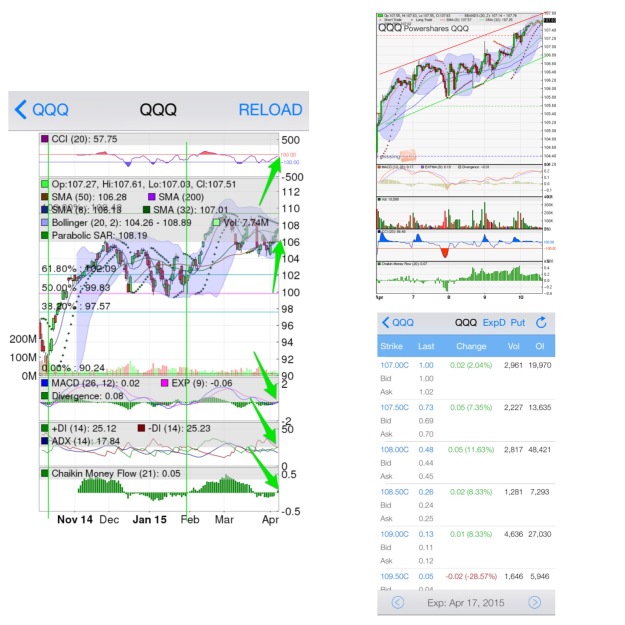
The starting blog image shows 6-month and 5-day chart images as well as the Call option chain for QQQ. These two chart periods will aid in predicting the QQQ pps trends in the short and mid-terms.
Mid-term Prediction
The 6-month chart, from iPhone app Stock Station, includes chart indicators CCI, MACD, ADX/DMI, and CMF and overlays Bollinger Bands (BBs), PSAR, and Simple Moving Averages (SMA) 8, 32, 50, and 200 (see the Chart Analysis blog post for acronym explanations).
CCI is trending upward and above 0, at 57, signaling buy. A CCI of 100 or greater is considered overbought and signals an analyst to wait for CCI downtrend which would signal trend reversal.
MACD is just starting to uptrend and has crossed the threshold. The threshold is the neutral line with moves above signaling buy and moves below signaling sell. MACD above the threshold is a bullish indication. MACD above the MA line is a buy signal.
+DM is beginning to trend upward and move above -DM which will signal buy. The ADX at 17 is signaling a weak trend. Since sell has been the trend, meaning -DM has been leading, the ADX is signaling the downtrend as weak. A rising ADX above 20 with rising +DM would be a bullish indication.
The CMF has just crossed 0 signaling buyer support. Greater bars suggest a stronger momentum while smaller bars suggest weak momentum.
The pps candlesticks are trending in the upper BB region, divided by the center MA line, signaling buy. Touches above the upper BB line would suggest overbought and signal an analyst to watch for pps trend reversal.
PSAR dots are below the pps candles and that signals entry or hold with the current trend. A PSAR dot above the pps candles would signal exit or short sell.
The green vertical lines annotated on the chart represent the last strong buy signals, where most indicators and overlays are signaling buy. These points of reference aid in possible future chart indication and signal analysis. I use a general mix of indicators and overlays that predict well with most tickers with decent volume. An analyst wants to make sure an indicator or overlay has been predicting trends historically before trying to utilize to predict future trends.
The chart is signaling early buy indication for a mid-term option trend. A rising ADX with rising +DM, a continued MACD rise, and stronger (longer) CMF bars upward would signal better buy indication is seen twice the past six months.
Short-term Prediction
The 5-day chart can be analyzed like the 6-month view to predict the short-term pps movement of $QQQ. Notice how the pps candles and chart indicators oscillate more often. The reason, short time period charts often have minutes of information charted versus hours or days on larger period charts.
The indicators are signaling buy in the short-term. CCI is 86, MACD is above the threshold and CMF bars are above 0. It should be noted that these indicators are expressing a sign of possible reversal to come. CCI is dipping, MACD is at a highest point in the past five days, and the CMF bars are shrinking.
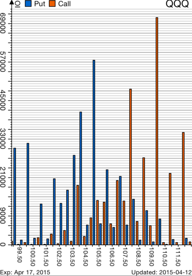
Option Chain 

Option chains show important data for options to be traded such as:
+ Option strike price
+ Option expiration (expy)
+ Current price
+ Bid and Ask
+ Option volume
+ Contract open interest
The attached option chains are from StockStation and MarketWatch Big Charts. Each provides a different perspective to see option data.
Researching option chains and option movements can be time consuming. Depending on your holding period looking through all strikes for volume and open interest changes may not be needed. An example is day trading. If a trader can simply predict the hourly chart trends of $QQQ then gains can be exited before the effects of volume and open interest take effect. For mid-term holds large volume and open interest changes can provide clues to other traders intentions.

Stock Station, and screening websites, can aid in finding unusual option volume or open interest changes. You can see other option screens available in the above image as well.
Option Charts


QQQ Top Holdings


